Responsive vs. Mobile-First Design: What’s Right for Your Business?
Posted at Jul. 4, 2025
Everyone knows mobile matters. But does your website treat it as a priority — or an afterthought?
In today’s digital-first world, your website isn’t just being viewed on mobile devices — it’s being experienced there. And how that experience feels can make or break your business online.
You’ve probably heard of responsive and mobile-first design. While they sound similar, they’re actually two different approaches to creating modern websites — and choosing the right one can significantly impact your performance, conversions, and user satisfaction.
So which approach is right for your business? Let’s break it down.
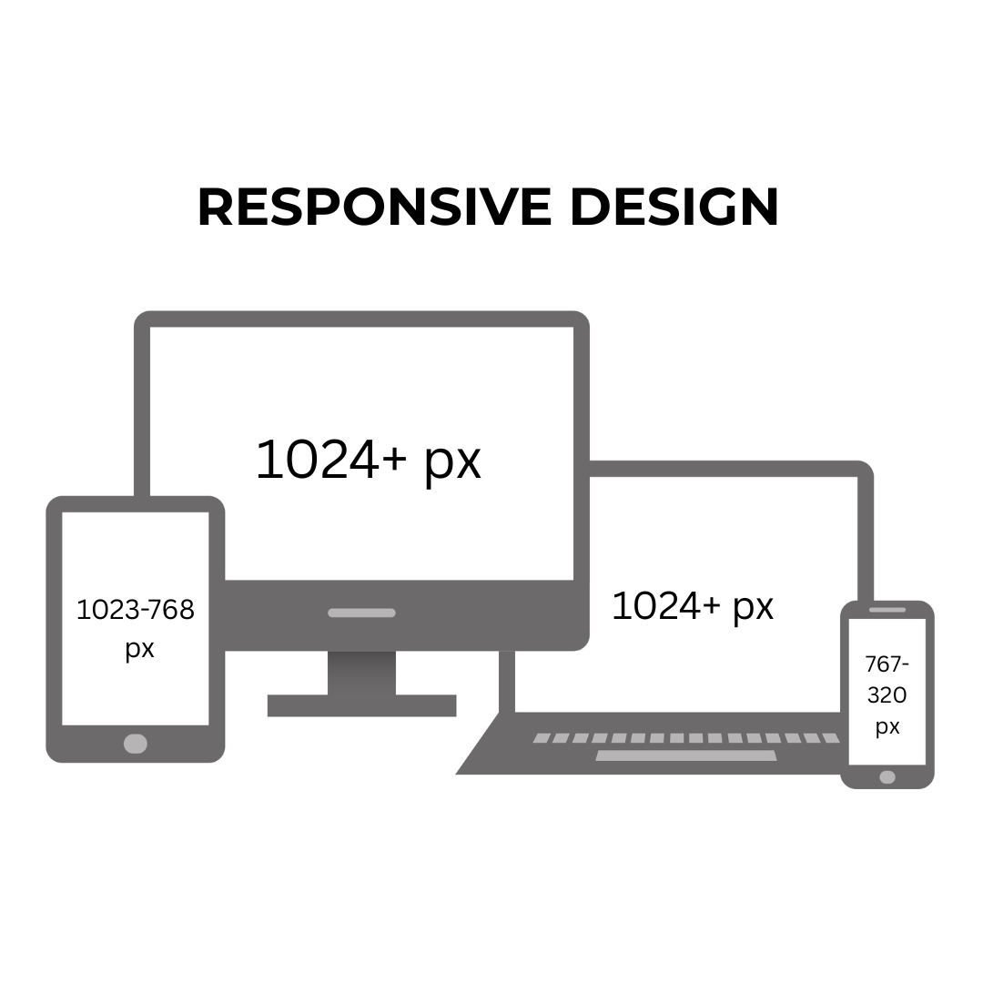
🔄 What is Responsive Design?
Responsive design means your website adjusts to fit any screen size — desktop, tablet, or mobile — after being built primarily for desktop.
- The layout “responds” to the screen using CSS media queries
- Images, text, and elements shift, shrink, or stack
- Desktop design is the default; mobile layout adapts from there
✅ Good for:
- Corporate sites with heavy desktop traffic
- Content-heavy platforms
- Businesses with limited mobile engagement
⚠️ Watch out for:
- Clunky mobile UX if not tested carefully
- Slow load times from unnecessary desktop assets
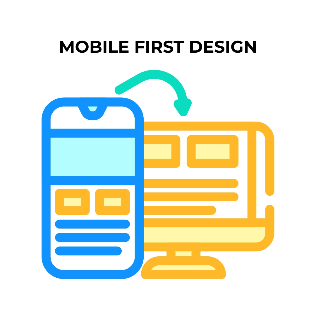
📱 What is Mobile-First Design?
Mobile-first design starts with the smallest screen first — and builds upward. Instead of adapting down from desktop, it builds up from mobile.
- Prioritizes performance, clarity, and simplicity
- Adds features progressively for larger screens
- Forces a tighter focus on what really matters to users
✅ Good for:
- E-commerce or apps with heavy mobile usage
- Startups targeting younger, mobile-first audiences
- Any business that wants a fast, focused UX
⚠️ Watch out for:
- Requires more intentional planning up front
- Complex desktop features may need extra design work
🧠 Why It Matters for Your Business
In 2025, mobile isn’t optional — it’s the baseline.
📊 Over 60% of global web traffic is mobile. And Google now indexes mobile versions of websites first.
That means if your mobile experience is:
- Slow
- Confusing
- Hard to navigate
…you’re losing customers before they even see your headline.
Your choice between responsive and mobile-first isn’t just about design — it’s about prioritizing how your customers engage with your brand.
🧩 So… Which One Should You Choose?
Here’s a simple guide:
|
Business Type |
Best Fit |
|
Service-based (B2B) with desktop-heavy audience |
Responsive |
|
E-commerce or customer-facing app |
Mobile-First |
|
Startup or early-stage product |
Mobile-First |
|
Blog or publication with wide device traffic |
Responsive (well-optimized) |
|
Building from scratch? |
Mobile-First is the smarter default |
💡 Pro Tip from Techstacks:
We often recommend a mobile-first mindset — even when building a responsive site.
Why? Because it ensures that:
- Content is prioritized clearly
- Page speed stays top of mind
- The most important user experience — mobile — is never treated like an afterthought
🚀 Final Thoughts
Whether you're redesigning or building from the ground up, your design strategy isn’t just a technical decision — it’s a business one.
If you’re not sure what approach makes the most sense for your audience, we can help.
At Techstacks, we combine data, UX strategy, and clean development to create websites that perform beautifully on every device — especially the one in your customer’s hand.